


Overview
The Problem:
Oceana's website lacks clear and concise information about their organizational purpose and the allocation of donations, leading to confusion among visitors and a lack of motivation to donate.
Possible Solution:
Revamp the website by emphasizing Oceana's mission prominently and implementing an intuitive navigation, ensuring users can easily explore and navigate the site with clarity and coherence.
Project Duration:
3 weeks
Team Members:
4
Tools Used:
Figma, Miro, Illustrator
My. Role:
Took a lead role in the design of lo-fi and mid-fi wireframes for donations, pivotal contributions to the style guide, homepage layout, and hi-fi desktop donation process, ensuring holistic user-centric design and visual coherence.
My Design Thinking Process
01 Discover
-
In the discovery phase, I explore user behaviors, needs, and pain points. Through methods like interviews and analysis, I gain insights essential in forming the basis for a user-centered design approach.
-
During this phase, I transform user insights into a problem statement, setting clear goals and aligning the design solution with user needs and business objectives.
-
In the ideation phase, I creatively brainstorm and explore solutions to tackle user challenges. Through collaborative sessions and unconventional thinking, I am able to generate innovative ideas that help to develop impactful design solutions.
-
In the prototyping phase, I transform ideas into interactive mock-ups, refining the user experience through iterative testing and feedback. This process helps blend concept with implementation, ensuring an effective human-centered design solution.
-
In the test + evaluate phase, I examine the prototype through user testing, iterating on the design based on feedback. This step confirms functionality, addresses issues, and ensures an optimal user experience before final implementation.
Research
To better understand our user’s needs when donating to Oceana, we conducted 3 user interviews.
Research questions:
When donating, which type of pathos do you find works most effectively on you?
Do you think individual citizens/people have a responsibility to care about the ocean? If not, whose responsibility do you think it is?
Do you research organizations before donating to them?
Has a website’s design ever affected how much you trust it with your credit card information?
Research Findings
Researches before donating to an organization
Only donates to charities they trust
Wants to understand the impact of their donation
Donating makes them feel like a better person
02 Define + Analyze
Affinity Diagram

User Persona

User Insight
Before donating, users like Donna need to see that a charity’s website is trustworthy and easy to navigate because they want to feel safe giving their money. Also, a user is more likely to donate if they feel an emotional connection to the charity has been established, because it makes them feel better about themselves for donating.
To identify the site’s pain points, we conducted a heuristic evaluation on the site’s appearance/aesthetics, content, navigation, and efficiency/functionality. From our evaluation we determined four main areas for improvement.
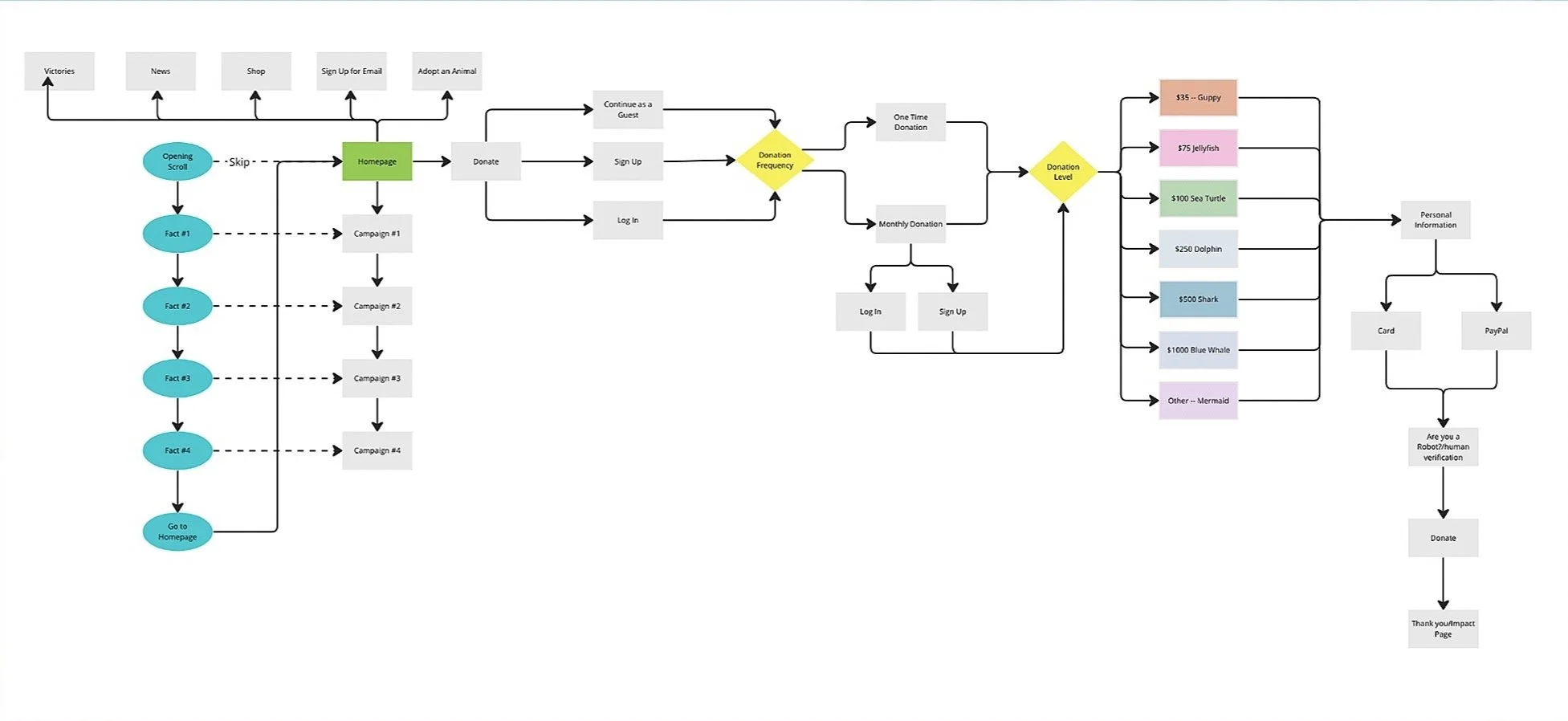
Confusing Navigation
Conflicting primary user goals
Hidden Features
Spacing and formatting issues

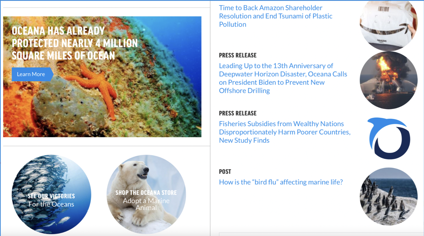
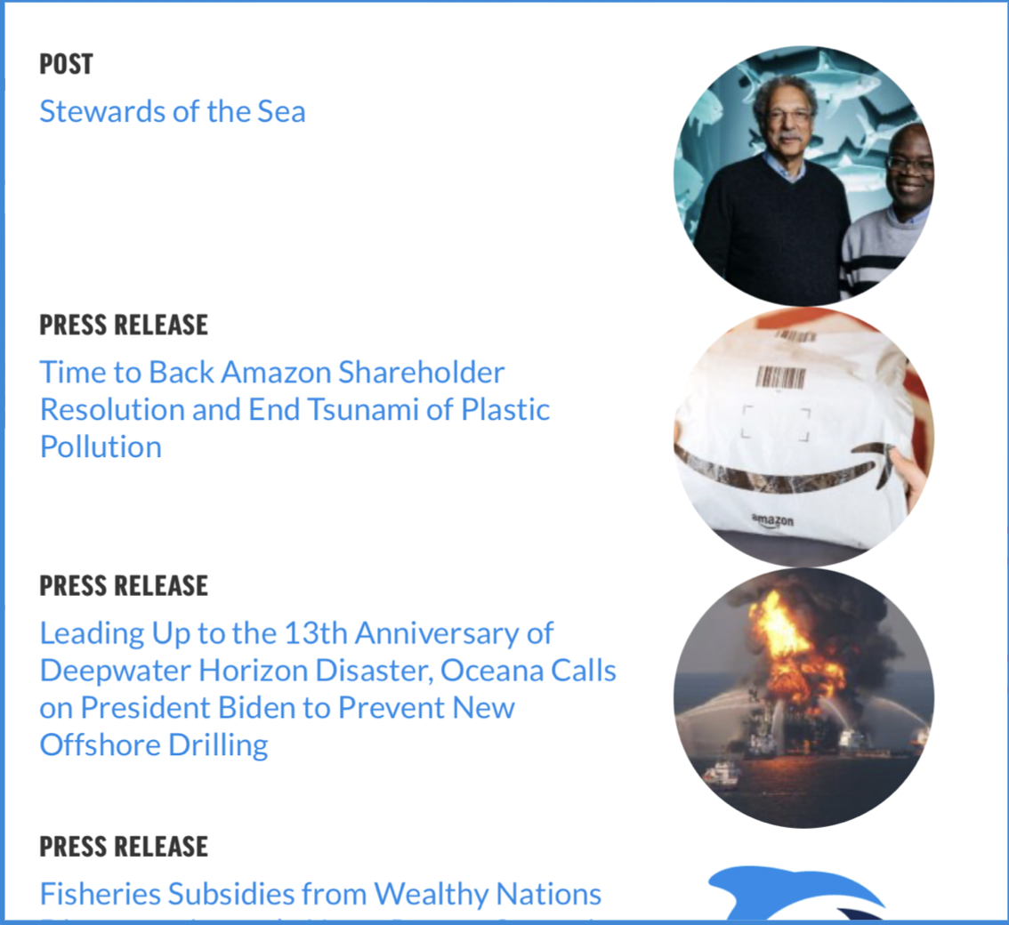
3. Some valuable pages like the Shop and their Victories pages aren’t well highlighted or presented in an easily understandable way
4. General improvements to the spacing and layout of the website to make it cleaner and more visually pleasing
Our Goals:
Highlight donations as the primary purpose of the site
Clearly articulate and present Oceana’s mission
Increase overall user trust and confidence in the impact of their donation
Improve navigation consistency and general layout and formatting

03 Ideation
Heuristic Evaluation

User Flow
Brainstorming
2. There are two different action items being presented to users above the fold on the home page, making the goal of the website and what the goal of the user should be, unclear

Feature Prioritization Matrix

User Story
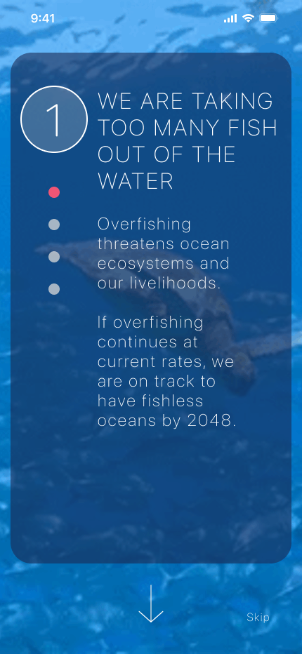
Homepage

Contact Info


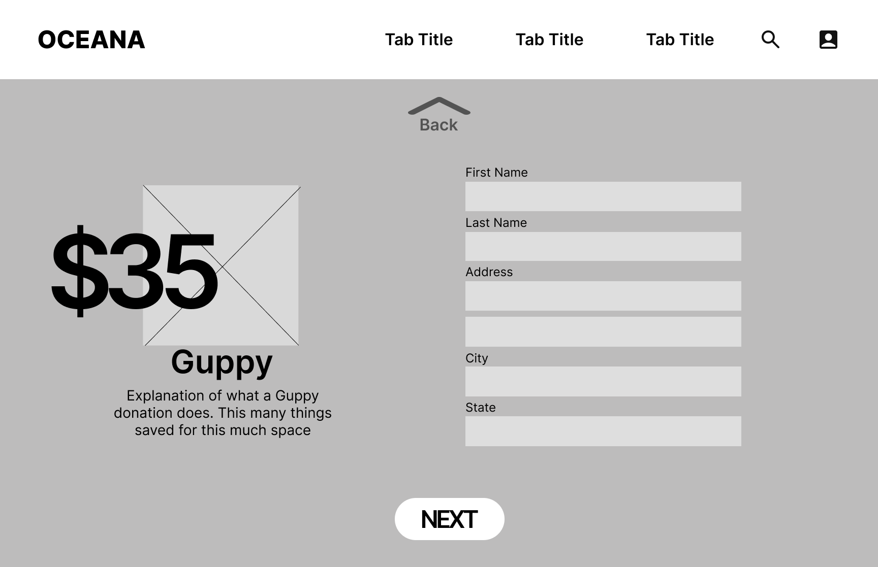
Lo-Fi Wireframes (Desktop)
Homepage
Contact Info
Hi-Fi (Mobile)
Homepage

Donation

Hi-Fi (Desktop)

Homepage
Donation

Style Guide
Contact
Contact
Donation

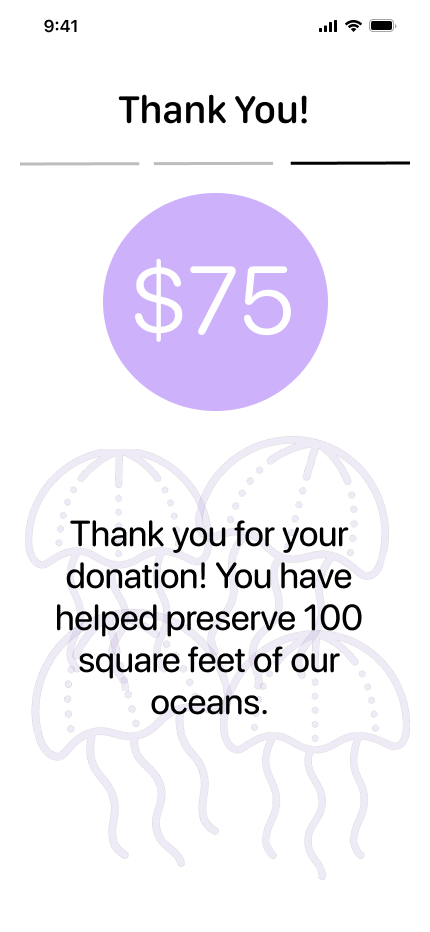
Thank You
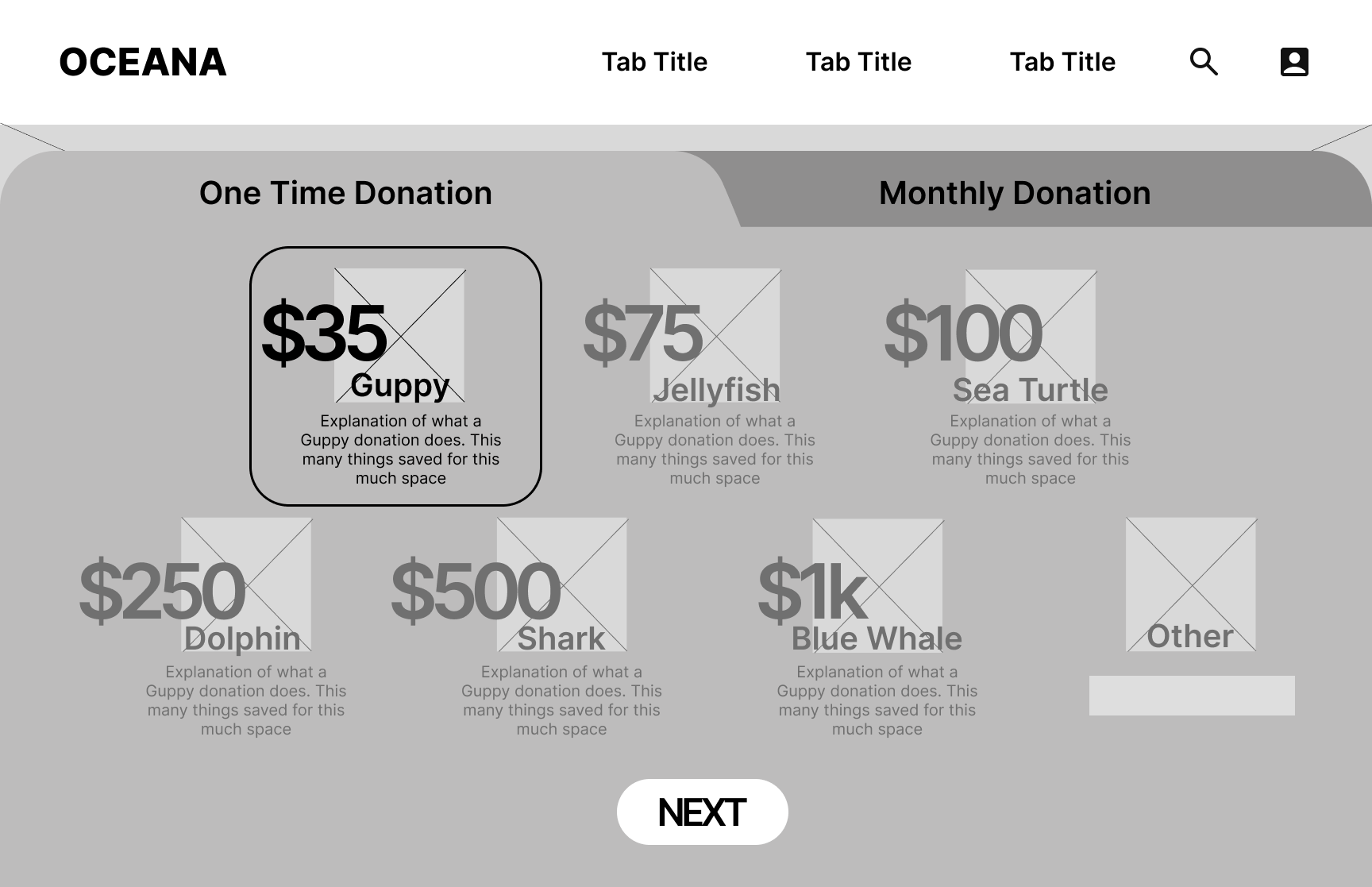
Donation

Payment

1. Confusing and duplicative navigation with multiple tabs that lead to the same place
After

Testing Feedback:
People found prototype A to be a better user experience for the donation flow
They found the stepper very helpful
They felt that the process was clear and seamless
It was more difficult to move forward with version B because you had to scroll to find the button
Prototype A

After
Payment
Payment

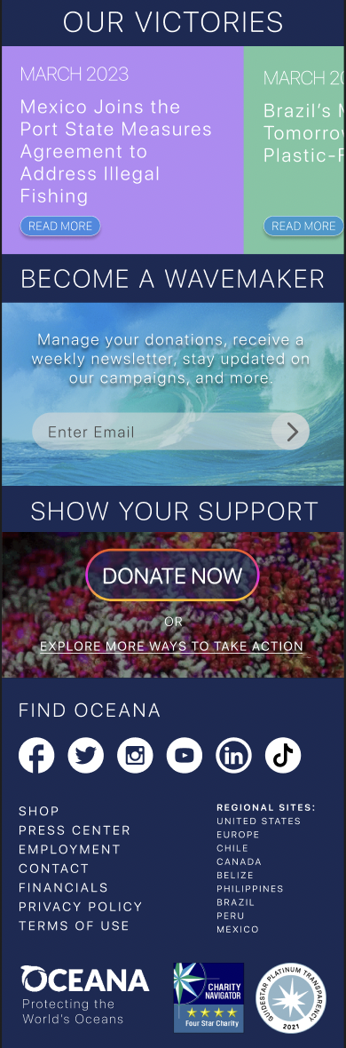
Footer
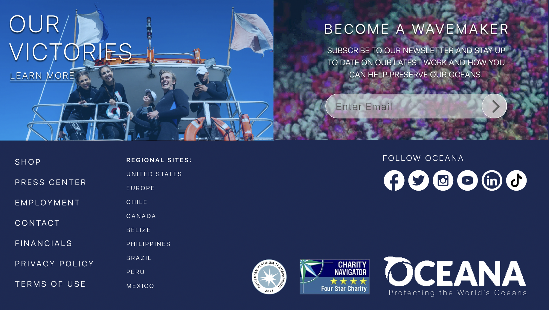
Footer
Payment


Prototype B

To test the effectiveness of our redesign, we ran 5 user tests.
User Testing Plan:
Can users tell us what Oceana does as an organization after using app?
Can users donate $75 successfully?
Can users utilize the menu navigation to find the ‘About Us’ page
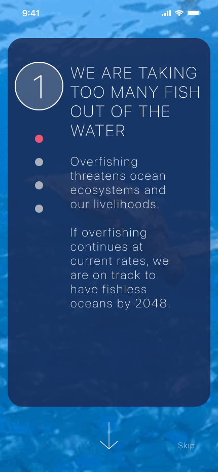
—made splash screens more legible

—made Log In screen more versatile
—Took the concept of the opening scroll for the mobile version and transplanted to desktop to drive in the storytelling
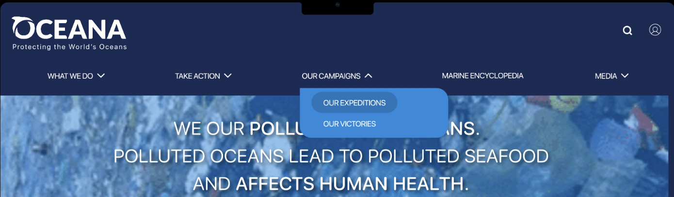
—Added a drop down menus for more direct navigation


Before
After

Final Prototype
04 Prototype
Lo-Fi Wireframes (Mobile)
A/B Testing
User Testing
Iterations
Before
Before